Re - creating a building of choice with elements of colour. I went further in adding a different take on the building as a whole. We were told to refer to Norman Foster's works.
Thursday, November 24, 2011
Monday, November 21, 2011
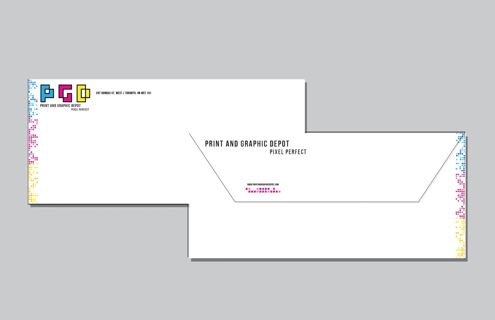
Typography: Final Print and Graphic Depot Store Re-Design
![]() |
| PGD Merchandise |
![]() |
| Logo |
![]() |
| Logo, Typraphy, Color Palette |
![]() |
| Business Card |
![]() |
| Envelope Design |
![]() |
| Letterhead |
![]() |
| Interior Poster 1 |
![]() |
| Interior Poster 2 |
![]() |
| Truck Idea |
Saturday, November 19, 2011
Some Print and Graphic Depot Business Card Designs
Not quite done with the store redesign project for typography class, although I wanted to share some of the ideas I had for the business card layouts.
Friday, November 18, 2011
Wednesday, November 16, 2011
Communication Design - Pattern Wallpaper Assignment
Tuesday, November 15, 2011
Color in Context - Sphere of Commerce logo design
For color in context class we were told to choose a logo of any sorts and manipulate it in a way that utilizes techniques such as balance, transparency, geometric forms etc. This would be used as our design to put in the shadow box we all created. We were then told to use a pointilistic form and create our new logo design. Our limitations consisted of only 5 colours which were used in our previous project. My logo choice to manipulate was the NBA men's basketball logo.
Mess to Masterpiece
Spent some time working on a project using acrylic paints. I haven't had the time to wash out my pallet but I love the way the colours stand out. I thought it was a masterpiece in itself!
Sunday, November 13, 2011
Typorgraphy - Spirit Tree Cider Labels
For this project for Typography class we were told to develop a set of four product labels for a cidery/bakery called "Spirit Tree". The labels included one for cider, apple sauce, bread and croutons. I used very festive colours, red, yellows and green which also related to earth tones. I kept my design very simple and the logo was made simply by using a tree to take the place of the letter "T" in Spirit Tree. Each of the yellows represent a different product. I thoroughly enjoyed this assignment.
Thursday, November 10, 2011
Communication Design - Packaging in 3D form!
Came to university early to put the finishing touches on my packaging project. He wanted a 3D version so I printed it on matte paper and ta-dah! Here's how it turned out to look. I'm really pleased at my improvement since my previous version wasn't all too great. Learning new techniques in photoshop and illustrator from my classmates really paid off!
Wednesday, November 9, 2011
Communication Design - Design Dictionary
We have had an on going group assignment which was assigned at the beginning of the school year. Since the winter semester is coming to a close, we needed to start getting finished. The assignment was to create design dictionary for students that may want to come to OCAD or perhaps just want to read up on some important design terms. My group decided to create a dictionary in the fashion of a scrap book. We both got two pages to fill up and design in whatever fashion we wanted. Here are my two!
Because I was unsure as to how our group leader wanted our book to be created, I designed a few more templates!
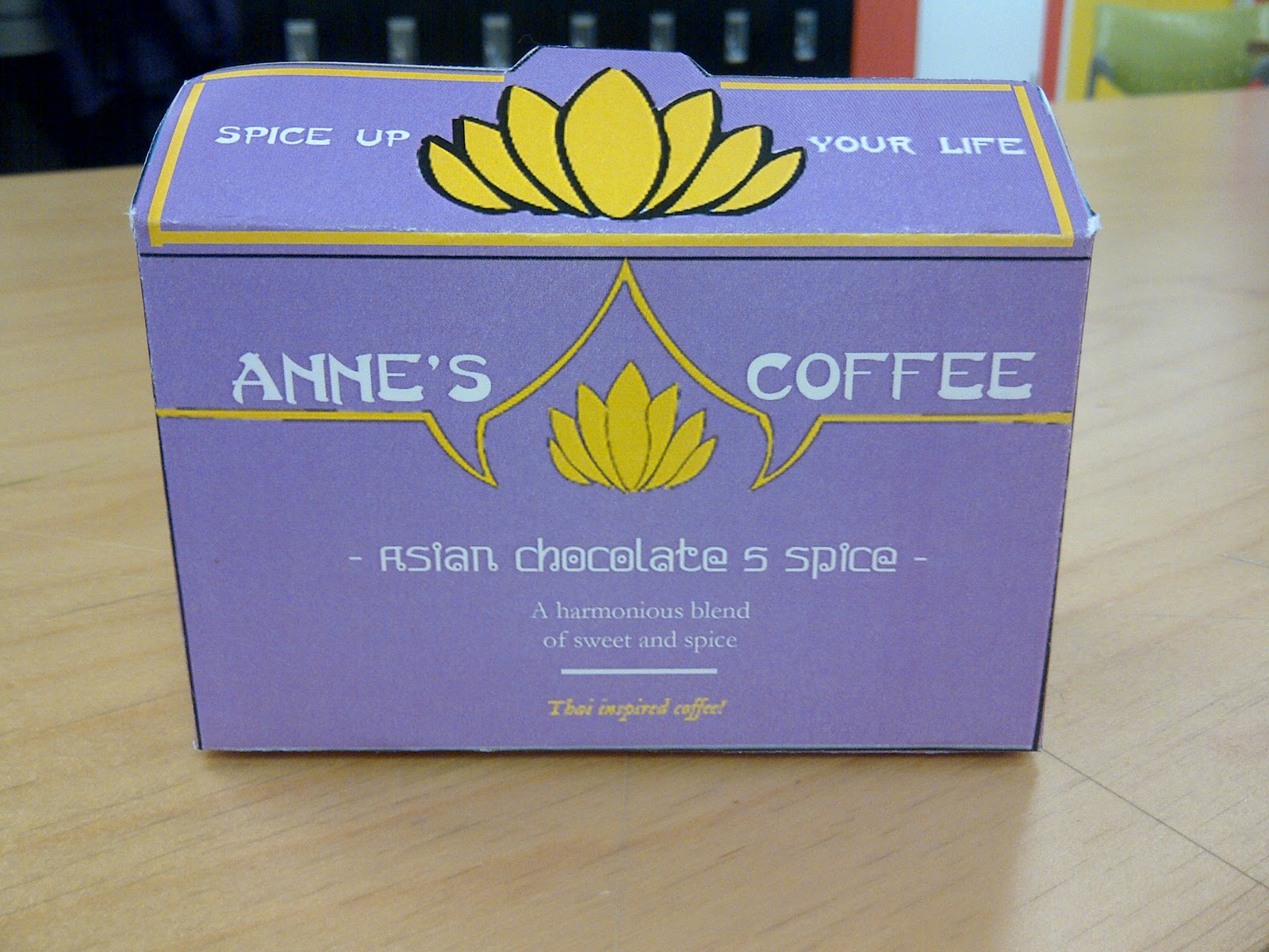
Communication Design- All Wrapped Up!
For this project we were required to design a packaging for any item, whether it be a food, a snack or perhaps a bottle of perfume, as long as it described a little about our personalities. I decided to do a Coffee that was an Asian chocolate 5 spice flavour. The ingredients included humour, class, charisma, style etc. The idea was that because I am half thai and half jamaican it would be asian flavoured but had a chocolate tang to it! Your very own chocolate fantasy! I created the box and design the sachet to match. I hope I do well with critique tomorrow.
Subscribe to:
Posts (Atom)