Wednesday, January 12, 2011

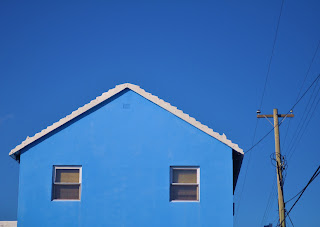
BERMUDA HOUSES COLOR


Looking at COLOR in photography


This project required us to change the way we viewed color on a daily basis! I was on a walk to the bus stop from my resisdence at uni and noticed that many of the doors of the houses I saw constrasted with the cars in front of them. I used to think houses in the UK were dull and boring until now. Its interesting how I didn't notice these colors before this project!

Our Video! Don't Be in the Dark About Aids!

INTERNATIONAL AIDS DAY! 2010 DON'T BE IN THE DARK ABOUT AIDS


BRIEF: On Tuesday Decemeber 1st it will once again be Internatiional Aids Day. As designers, your role as communicators here is vital, real and urgent: here is an opportunity to apply your creative and conceptual skills from drawing, typography, photography, 2D and 3D, etc. to a REAL, live issue. You are to create a series of events design publicity, print limited edition information (relating to your IDEA), perform activities, musical expierences. sponsored 'hobby-horse' races etc. to raise money and awarness in the public domain. INTERACTIVE ADVERTISING: working in teams you are to investigate throughly any issue relating to funding, public opinion, politics, social and cultural mis/understandings and mis/information, and medical research into AIDS and HIV: local and global, personal and public.

PROJECT IDEA: Our idea came from the statistic 9/10 people are undiagnosed with AIDS. We were encouraging them to not be in the dark about AIDS hence why we dressed in black. The person dressed in red had been tested and was aware and the others weren't and were shadowing her. In total we raised around 537 pounds which all went to the WOLANANI charity in South Africa helping women and children battle AIDS and HIV.

Create and Alphabet out of a shape!..Easy to do?


BRIEF: You have 3 hours to create a typface A-Z out of a shape you choose.

PROJECT IDEA: The shape we chose was a silhouette of a bird. We were to to pick an image and create a type-face. We were stuck in the beginning on how to pull this image apart, but our tutor told us not to think literally. We began playing around using different types of paper in the photocopier such as asitate so that we could overlap and multiply the images easily. Then we started to move the image on the photocopier while it was being photocopied which had many cool effects. The end result: the tutor liked the way that each letter differed from eachother and how we played with black and white contrasts. Our distorted bird images from the photocopier helped us create this. The class felt that our typeface was very sinister and it showed a lot of movement as if the letters could "take flight".

TREES TREES TREES! (Universal Principles of Design)


BRIEF: 'The Universal Principles of Design' is a book containing and describing a set of guidelines, laws, and examples of good practice and ideas drawn from a diverse range of design desciplines. This project will introduce you to some new concepts and working methods through a team-based exploration of word, image and object in response to a set of subjects; within a family. The project will introduce and explain how specific principles work and can be used to enhance commuication and the development of clear ideas or in a more ambiguous play with meaning - proximity, law of pragnatz, hierchary, five hat racks, readability, picture superiority effect, iteration, hierachy of needs and figure-ground relationship.

PROJECT IDEA: Our subject was TREES. We spent a lot of time researching many different trees and the features each one had. We began to focus on the idea of tree rings and how they almost represent a biography of a tree as each ring represents one year of tree growth and it shows how much water a tree got or didnt get as well as what trauma it suffered, i.e. forest fires. We displayed this information using card board cut outs to demonstrate how tree rings are displayed and formed. We cut strips and created circular shapes starting from the small (heartwood) to tthe large (outerbark). This was our 3D object. For our word we explored tree typography and decided to find type within tree rubbings as well as use a tree rubbing technique to create type. The words used were tree idioms such as "barking up the wrong tree" and "can't see the wood for the trees". For our image we decided to explore the relationships people, insects and animals have with a tree. We used a particular set of mapping with a key on asitate paper to allow the audience to flip up the pages and interact.

PEA GAMES!


BRIEF: What is the best VEGETABLE in the whole wide world? That's it really. Each group needs to choose a vegetable that they feel particularly drawn towards and then when everyone's chosen their favoured vegetable they need to put forward an argument as to why their vegetable is the best vegetable in the whole wide world. The winner will be the group who manages to convince the audience that their vegetable is the best vegetable in the whole wide world. Be creative and convincing!

PROJECT IDEA: The vegetable that we chose was peas. We were trying to persuade the audience that it was the most fun vegetable so we created "PEA GAMES 2010" which involved getting the audience to interact and get involved. The games consisted of pea shooting at a target, the pea spoon race, and pea flicking and we had pea medals for each winner. We came second place...PEA ARE THE CHAMPIONS!