Tuesday, February 22, 2011

Pocket Archive "KNOTS"


BRIEF:This project introduces you to the essentials of typographic nuance - positive and negative space, hierarchy, legibility and readability, 'tone of voice', sscale, stress - over a series/sequence of pages using InDesign. The technical aspects of this project will be introduced by applying a simple quotation to a series of pages. The exploration of fonts/typefaces, as embodying character and meaning (the inherent value of a typeface) will be tested to explore how this can be used to give a 'voice' to the text, to indicate accent, pitch, and rhythm. Your ability to develop these design skills and typographic awarness through experiment and testing will challenge the more popular notion of the "solid form of language" (Robert Bringhurst) as described below:

PROJECT IDEA: My pocket archive topic was knots. It was a random topic that I chose but became more intrigued and interested in the different places I could take it over a period of time. Through research I looked at typography using knots, knots with fashion, celtic knots, sailors knots, mathmatical knots, knots made by birds and even magical and spiritual knots to name a few. As the deadline for the final piece was fast approaching I began looking at knots in a more abstract way; how they communicate something else rather than being so literal. My 2 final pieces are based on knotted communication and connections made with people and places. The world map was cut out through canvas and the knotted strings behind it show how communication world wide can be misinterpretted. This is where communication barriers come into play. This was a representation of my personal expierence at university here in the UK. No one really understood some of the things I said or talked about. The second piece is based on my connections, mentally, speech wise and physically with certain countries. I've built ties with them over a period of time and now are emotionally connected. The mapping of the knots create a constellation like image, so I decided to add a galaxy and space background using acrylic paints.

Thursday, February 17, 2011

FINAL MACHINE! SCHWIRL


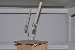
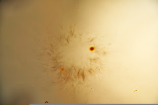
PROJECT IDEA: The adjectives we recieved were SWIRL, INFLATE and ROTATE. We created a spinning machine which rotated with pumps of wind blown from an air pump as it had slats inside to catch the wind. Candles were placed in this wooden machine so that they were able to rotate as well. The fire on the candles would reach a piece of paper above held by a slit inside a wooden frame which the machine was also placed in. This created our beautiful smoke mark swirls. The machine ROTATED, with the use of the INFLATED AIR and our mark created were SWIRLS.

TESTING for our Machine Final


Made beautiful smoke marks!

Visual Thinking - Undo; A Kinetic Exploration. SWIRL ROTATE INFLATE


BRIEF: Visual thinking (drawing) is an essential part of the design process and drawing is its most immediate form. You will be introduced to a number of learning techniques to aid your visual thinking, communication and conceptual development. Diagrams of the machine you are going to construct must be done, how effective your drawn diagram of your machine is, and the action you hope it will be preforming and the marks it will make on paper. Remember: the machine must be able to 'draw' without any other help other than winding up, pushing or throwing etc. As a group you will make a one-minute film of this event.


Wednesday, February 16, 2011

Sequence - Tone of Voice


BRIEF: This project introduces you to the essentials of typographic nuance - positive and negative space, hierarchy, legibility and readability, 'tone of voice', sscale, stress - over a series/sequence of pages using InDesign. The technical aspects of this project will be introduced by applying a simple quotation to a series of pages. The exploration of fonts/typefaces, as embodying character and meaning (the inherent value of a typeface) will be tested to explore how this can be used to give a 'voice' to the text, to indicate accent, pitch, and rhythm. Your ability to develop these design skills and typographic awarness through experiment and testing will challenge the more popular notion of the "solid form of language" (Robert Bringhurst) as described below:

"The space between letters, the space between words, bears no relation to the stutters and pauses of speech. Writing has none of the hestations of the body; it has only the hestations of knowing..." (Susan Stewart 'On Longing' 1993)

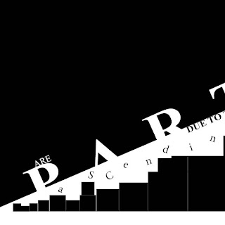
PROJECT QUOTE: "The cheerfulness and vivacity of youth are partly due to the fact that when we are ascending the hill of life, death is not visible; it lies down at the bottom of the other side." - Arthur Schopenhauer

Manifesto For Sustainable Design


BRIEF: The aim of this brief is to devise, write, design and present your own manifesto, in a small team, which questions the role of design within the context of sustainability. In the second of her series on sustainability in Creative Review magazine (Decemeber 2008) Anna Gerber says, "Graphic Designers are faced with a responsibility now, a responsibilty to fully integrate environmental criteria into the design/production process." Think about what you want to communicate. What particular message do you want to spread within this broad subject area? What statement do you want to make? Where and who to? It needs to persuade, influence, encourage, inform and inspire the viewer.

PROJECT IDEA: Our idea was to focus in on the subject of printing ink within design and companies. We found out that although black ink may be the cheap option, blue ink is much more sustainable as it has the least environmental impact. It is made from raw clay and is heavy metal free. Our manifesto was made in order to get people out of the conventional universal template of always using black ink for things like emails, newspapers, letterheads, and documents. Our designs were made with screen prints using only blue ink. This demonstrated going back to old printing processes in order to make us value our work more as designers.